


A good business with the wrong first impression
Z&Co had an established client base but wanted to attract higher-income homeowners planning larger renovations.
The original request was for a website redesign. But when I reviewed the existing experience, I saw a disconnect between the company's visual identity and the kind of work it wanted to attract.
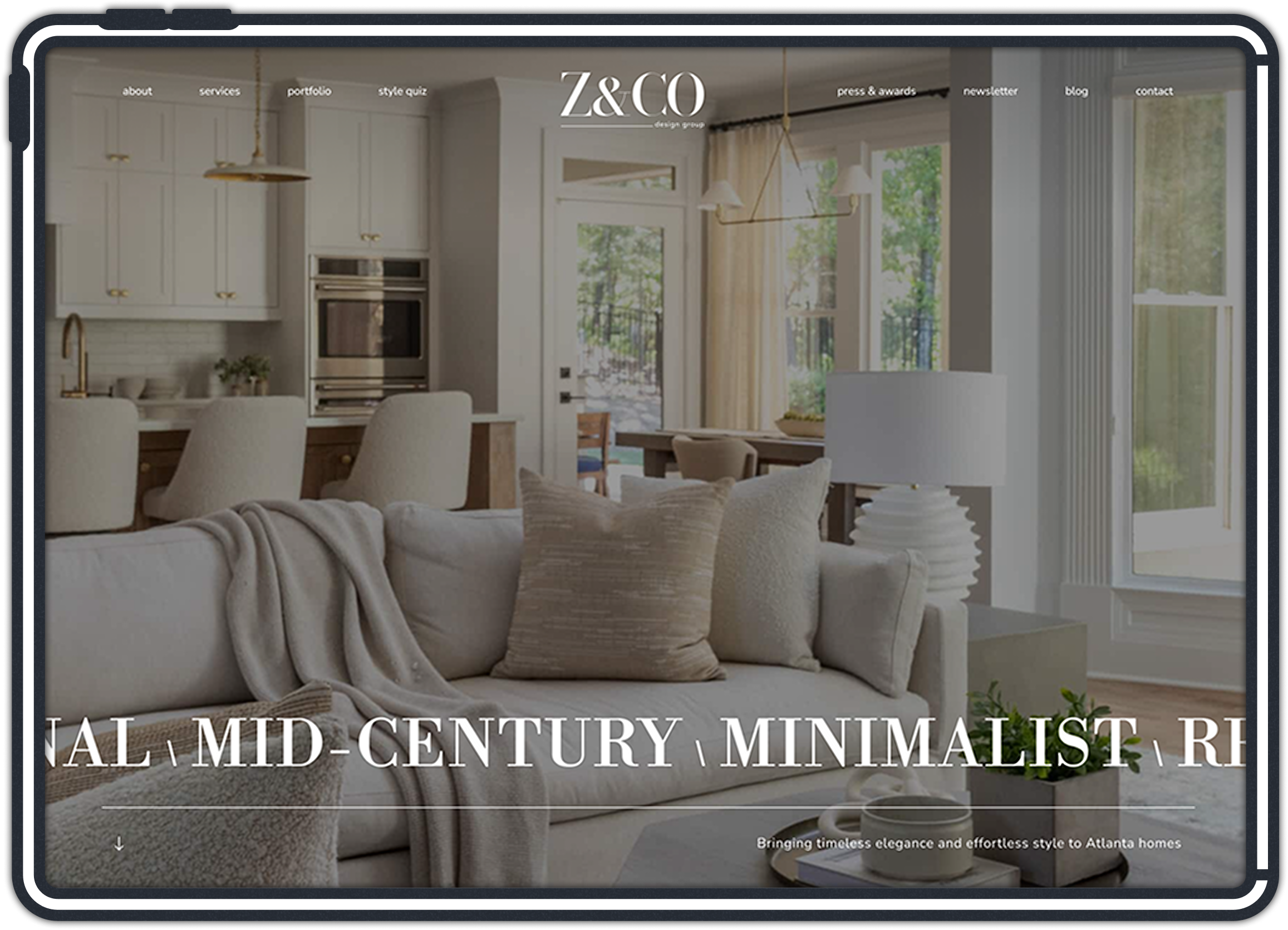
I recommended starting with the brand, then building the website around a visual direction that better reflected the business's goals.

The client was open to exploring something new, which allowed us to expand the scope before moving into website design.
my role
Lead Designer | Discovery | Brand Identity | Creative Direction | UX/UI Design
team
Account Manager, Project Manager, Developer
See why we started with the brand

Overview
Challenge
Approach
Design
Impact



challenge
A good business with the wrong first impression
Z&Co had built a successful interior design business, but wanted to take on larger projects and attract a more affluent clientele.
Its existing logo and visual identity weren't reflecting the level of work the company wanted to be known for.

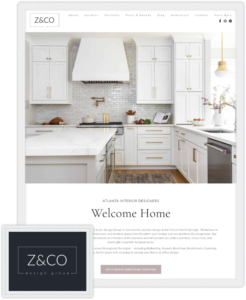
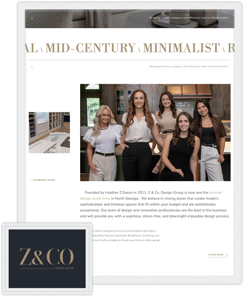
The initial request was for a website redesign. But as I reviewed the existing experience, it became clear that changing the website without addressing the brand would only solve part of the problem.
The client was open to seeing a new direction, so we started there.

discovery
Understanding where the business wanted to go
Before designing, I wanted to understand what made Z&Co different and what the business hoped to accomplish.
Through discovery conversations and brand exercises, I explored its positioning, services, audience, and goals for the website.
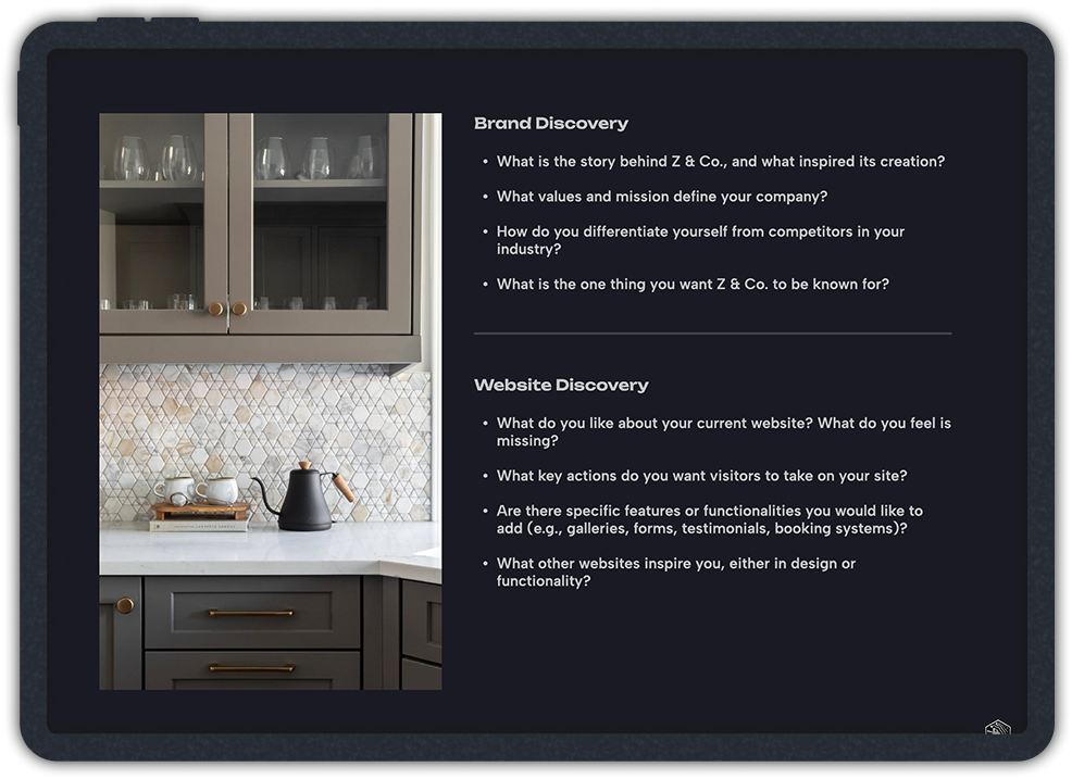
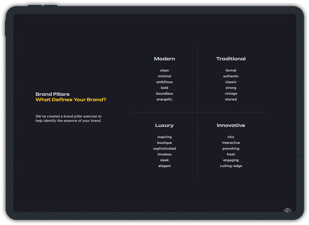
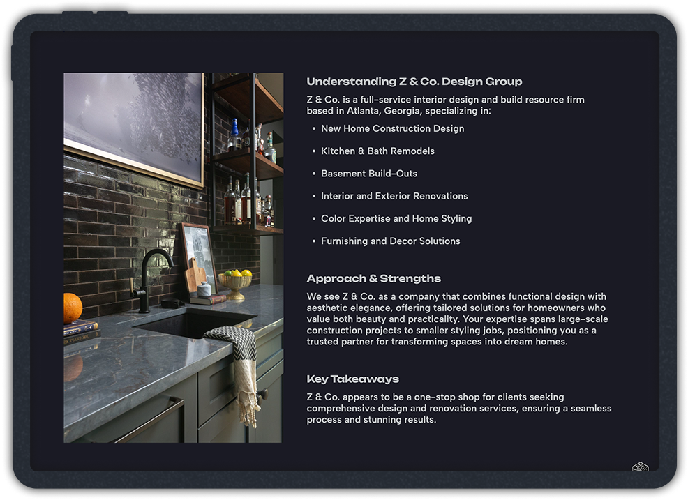
I also audited the existing content, explored several sitemap structures, and created content briefs to help organize the information and guide what each page needed to communicate.
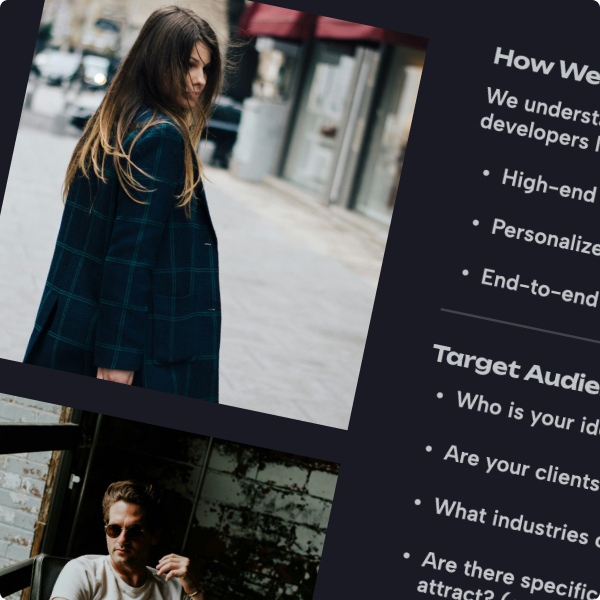
The goal was to make Z&Co's expertise easier to understand while giving prospective clients a clearer path to getting in touch.
creative direction
Finding a visual language that felt right for the audience
My experience working with luxury brands helped guide the creative direction.
I wanted Z&Co to feel more editorial and sophisticated, without losing the warmth and personal nature of an interior design business.
I explored three logo directions, from refining the existing mark to introducing something entirely different.
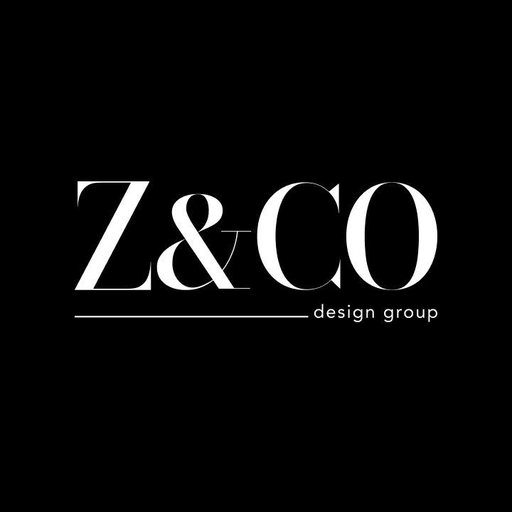
selected
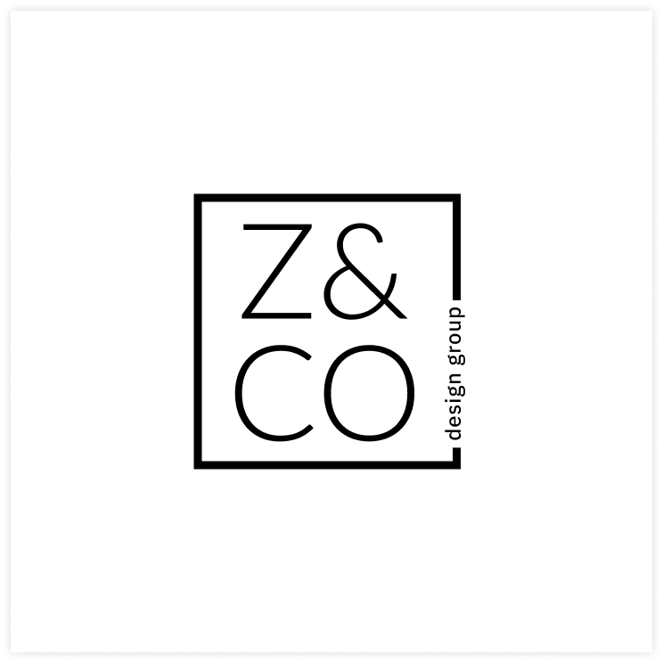
exploration
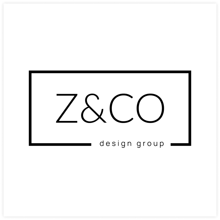
variation
The client selected a high-contrast serif wordmark in the first round, giving the brand a more distinctive and established feel.
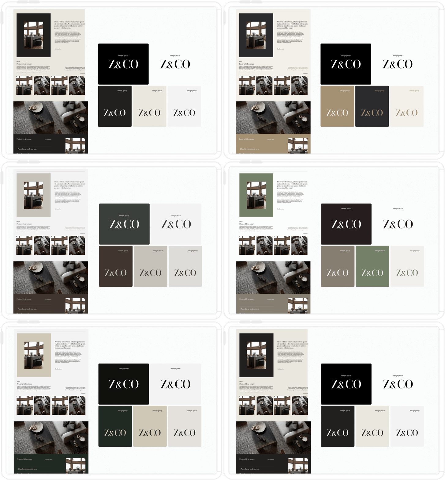
From there, I explored ten color palettes using the same website layouts to understand how each combination worked with typography, photography, and content.
We selected a palette of charcoal, champagne gold, warm ivory, black, and white.
I developed the final identity into a brand system with guidelines for typography, color, imagery, logo usage, and supporting applications.

digital experience
Giving the work room to speak for itself

With the information architecture and visual direction established, I focused on how Z&Co's portfolio could better communicate the quality and scale of its work.
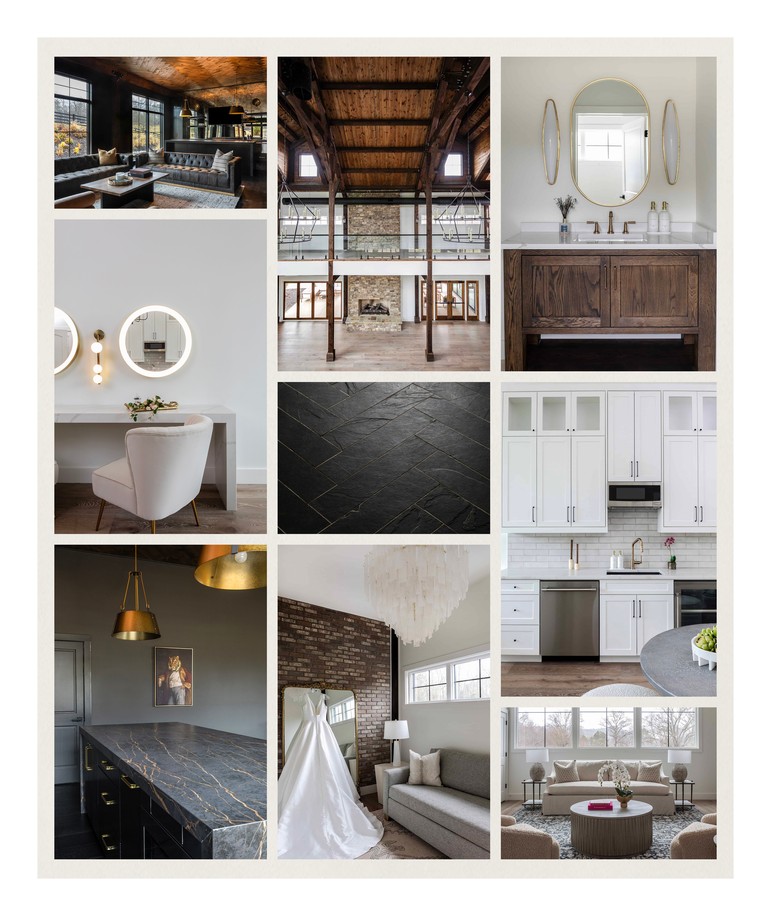
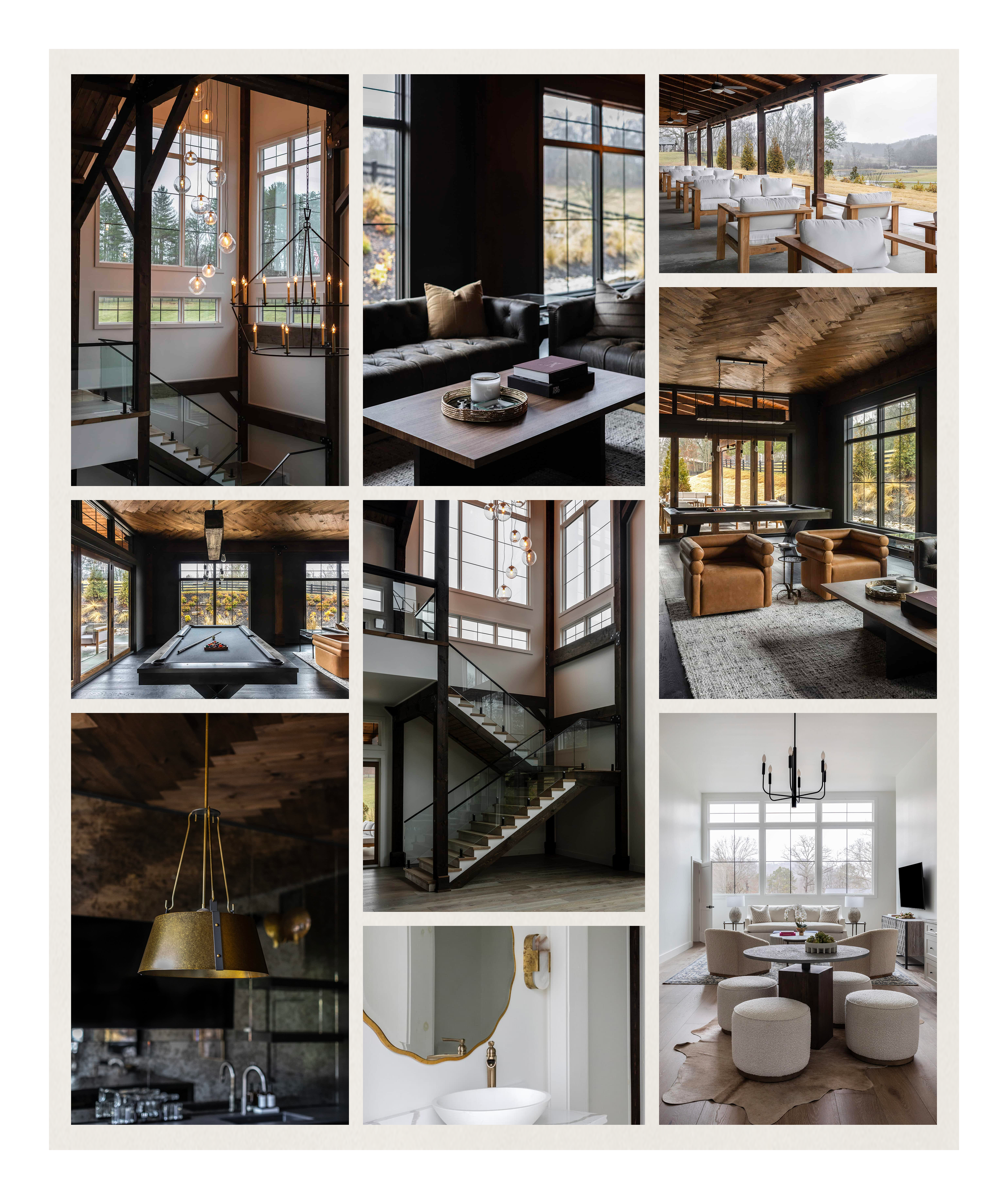
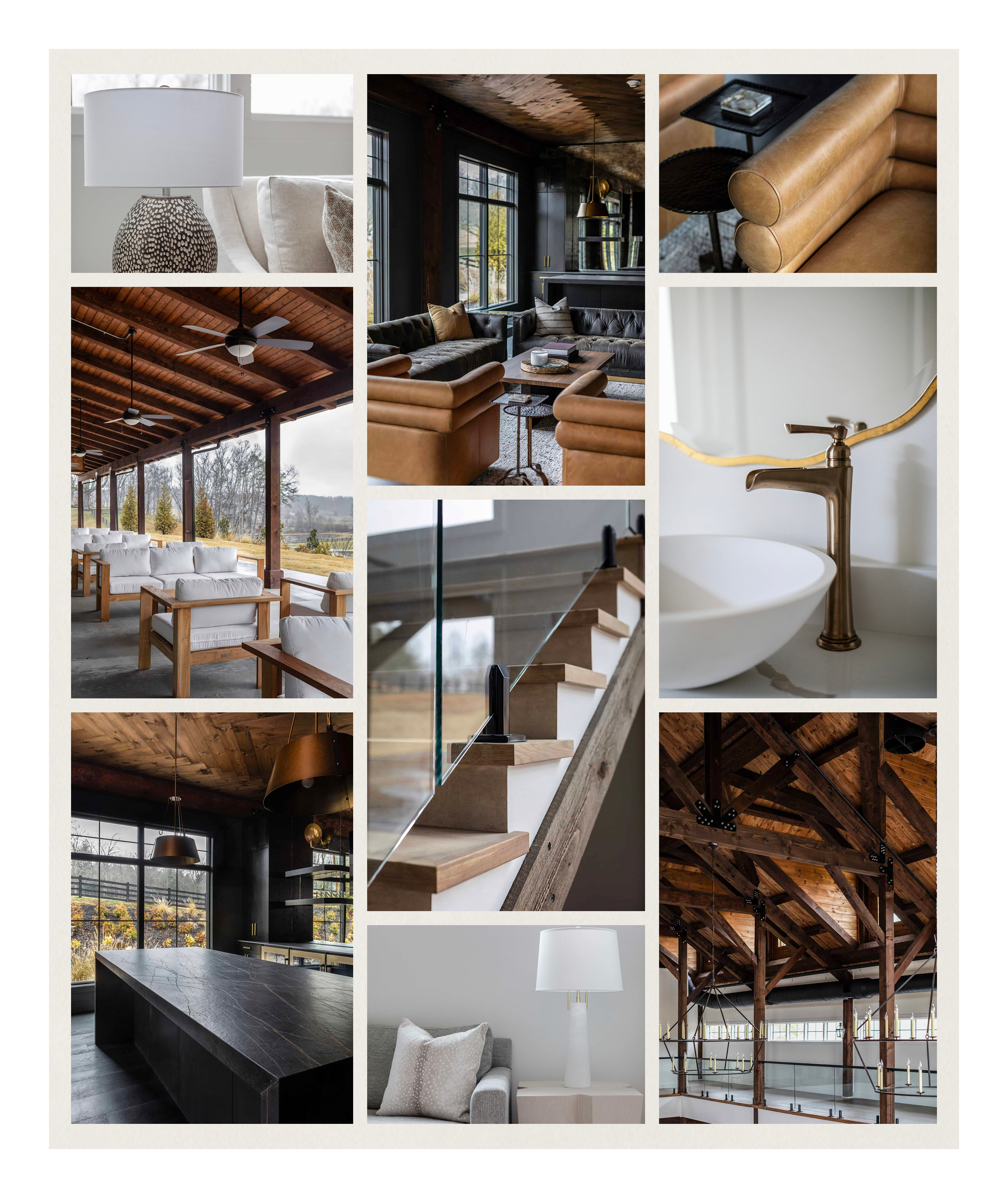
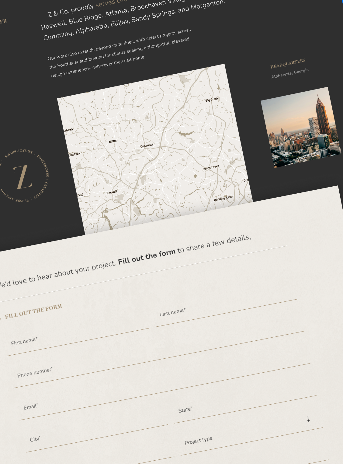
Rather than using a conventional image gallery, I designed animated masonry layouts that balanced architectural photography with smaller details, giving the work a more editorial presentation.
I created reusable Figma layout variations and collaborated with development on how images would be organized and implemented.
The goal was a flexible system that could accommodate different projects without requiring a completely new gallery design each time.
Making it easier to connect
Helping Visitors Take the Next Step

A strong portfolio was only part of the experience. We also needed to make it easier for interested visitors to reach out.
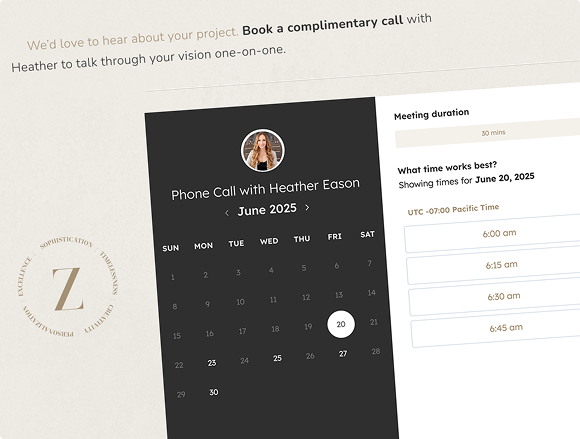
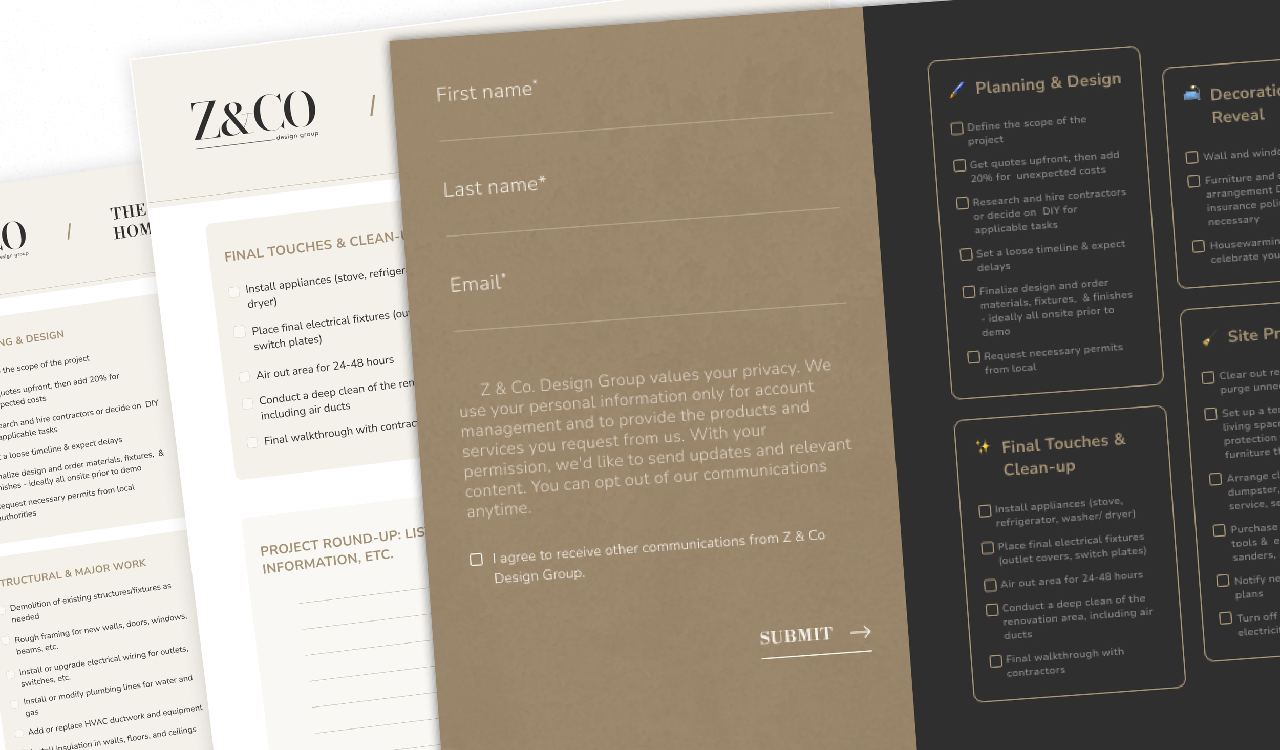
We added inquiry opportunities throughout the website, including a mid-page form, Calendly scheduling, and clearer calls to action.
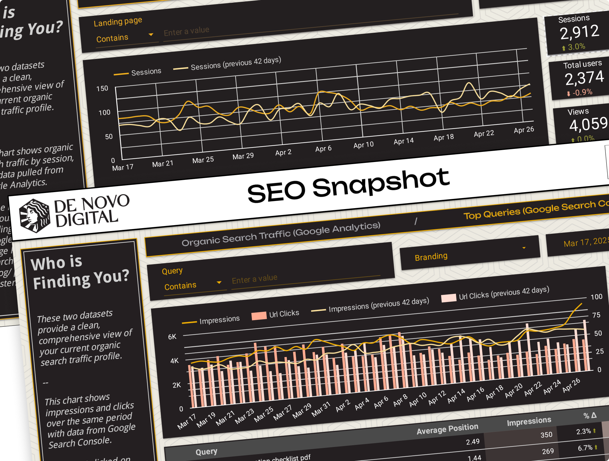
The website was supported by email campaigns and SEO work aimed at attracting more relevant traffic.
After launch, I joined weekly meetings where we reviewed performance data and discussed opportunities to improve the experience, including where supporting content should appear on the page.
These conversations helped keep our design decisions connected to how the site was performing.

Beyond the Website
One visual identity, different touchpoints
The brand refresh eventually extended beyond the original website project.
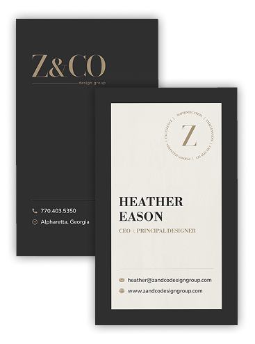
I applied the new identity to business cards, email communications, social creative, and branded resources.
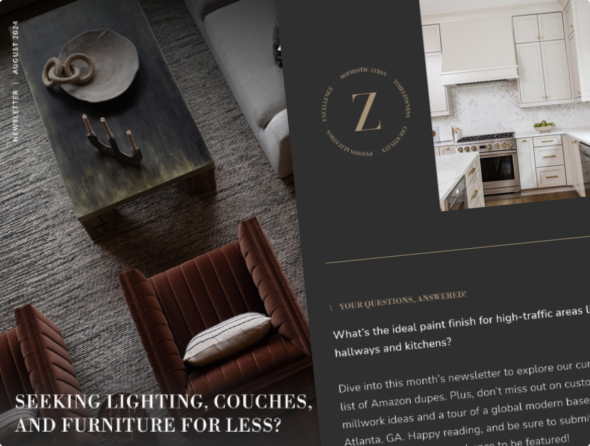
Having a defined visual system made it easier to keep the experience consistent, whether someone encountered Z&Co through the website, an email, or a printed piece.

impact
A clearer identity.

A stronger foundation.
27
%
increase in inbound calls
Client-reported within three months of the new identity's launch.
The new identity carried through the website, email communications, and advertising creative I designed as part of the broader marketing effort.
The agency's 2025 mid-year review reported a:
Unique click-through rate
0.15% → 1.17%
680% relative improvement
+275%
Website sessions
738 → 2,773
These campaign results reflect the combined work of creative, strategy, targeting, and media management, rather than design alone.
reflection
Understanding the problem changed the project.
What stayed with me about Z&Co wasn't just the new identity or website.
It was how much the original request changed once I understood what the business was trying to accomplish.
Z&Co needed a better website, but it also needed a brand that reflected where the company was going.
Starting with that understanding gave every design decision a clearer purpose, from the logo to the way projects were presented and how visitors could get in touch.
That's the kind of work I enjoy most: finding the right problem to solve before deciding what to design.


NEXT
PROJECT

From custom websites to a scalable design system.
How I helped turn a premium website concept into a reusable design ecosystem that scaled to 42 property websites.
