

From one premium template to a scalable website product ecosystem
I helped turn years of custom website expertise into a scalable product model—connecting premium collections, shared design systems, and a guided Theme Selector into one customer and delivery ecosystem.
Outcome
Customer
Clearer selection and faster onboarding
Business
A more scalable way to serve additional properties and portfolios
Product
Reusable theme, component, and configuration foundations
Operations
Fewer custom decisions across Design and Implementation
ONE TEMPLATE → REUSABLE PRODUCT FOUNDATION
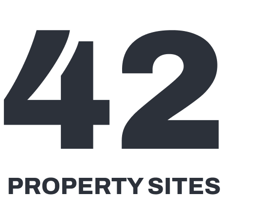
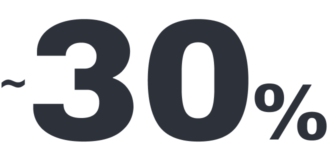
42 sites. ~30% premium-theme adoption
my role
Art Director
Product Design Lead
timeline
One-year product initiative
The initiative began with the first premium template and expanded into collections, shared design systems, and a guided product selection experience.
See the decision that protected scalability

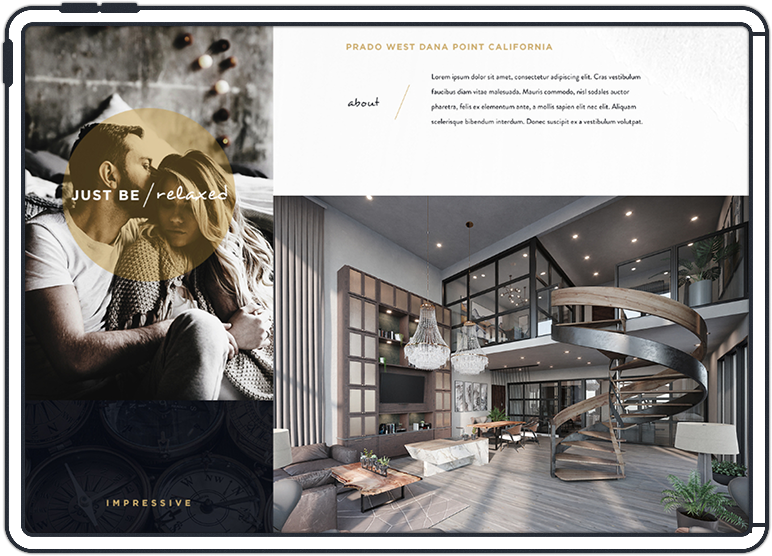
property site

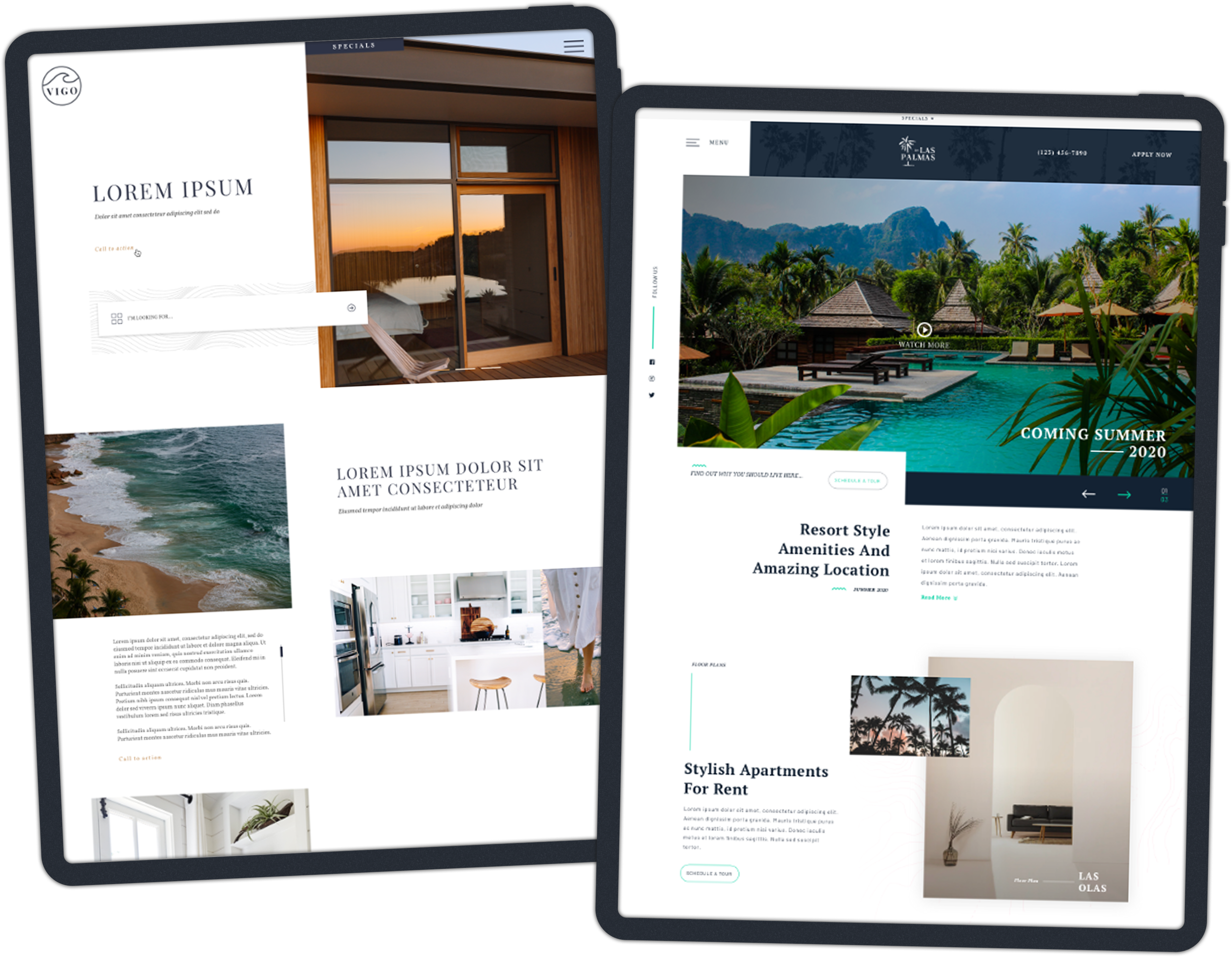
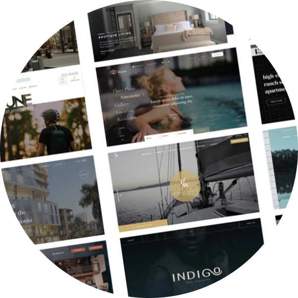
collection themes

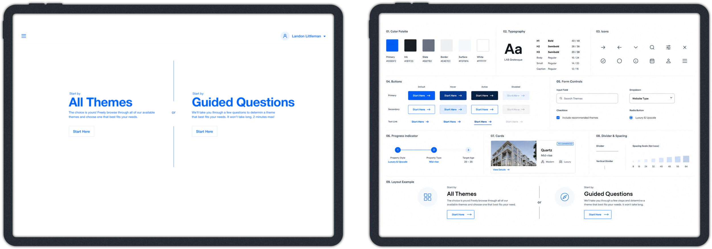
theme selector
Overview
Challenge
Discovery
System
Boundaries
Experience
Impact
Leadership
Reflection



challenge
Turning custom website expertise into a scalable product
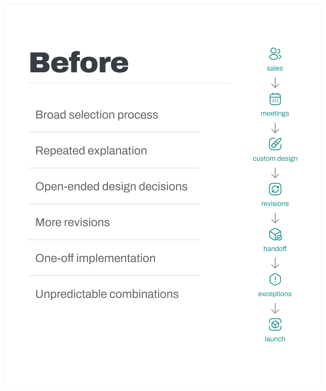
LeaseLabs' custom model produced strong work—and repeated the same discovery, design, and implementation effort for every customer. We saw an opportunity to turn that accumulated expertise into a scalable product without transferring the complexity to customers.
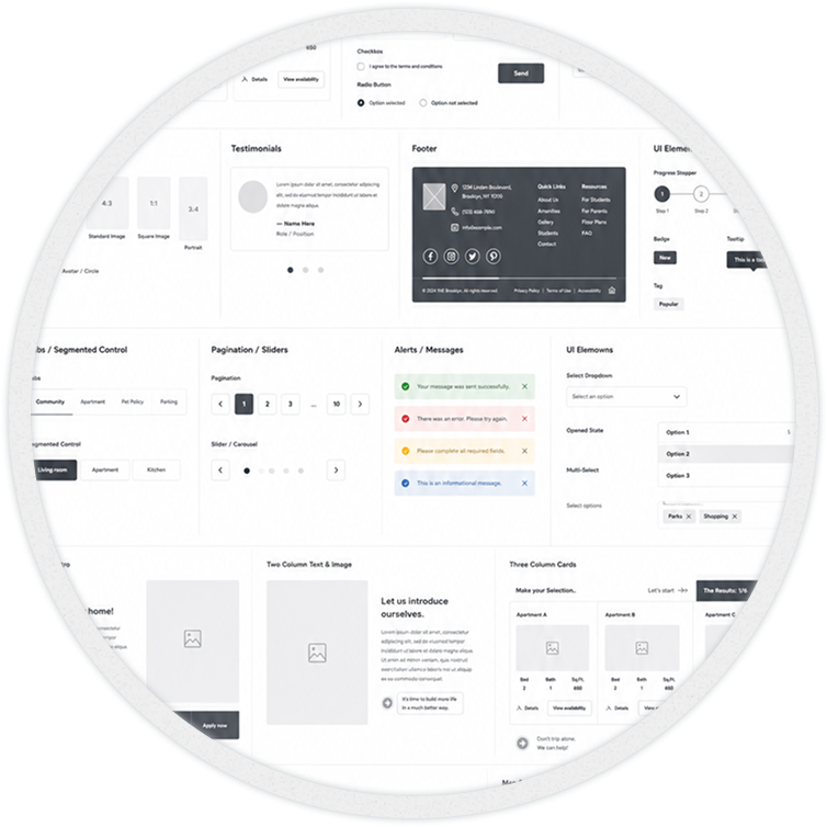
A fully open builder offered flexibility, but also more decisions, combinations and implementation complexity. We chose a curated theme ecosystem instead.
Fully custom

Maximum flexibility
More design hours
More meetings and revisions
Greater implementation effort
Difficult to repeat across large portfolios
Open modular builder
Greater decision burden
More component combinations
Extensive customer control
Less predictable quality
Greater CMS and QA complexity
Curated theme ecosystem


Faster selection
Meaningful brand differentiation
Reusable foundations
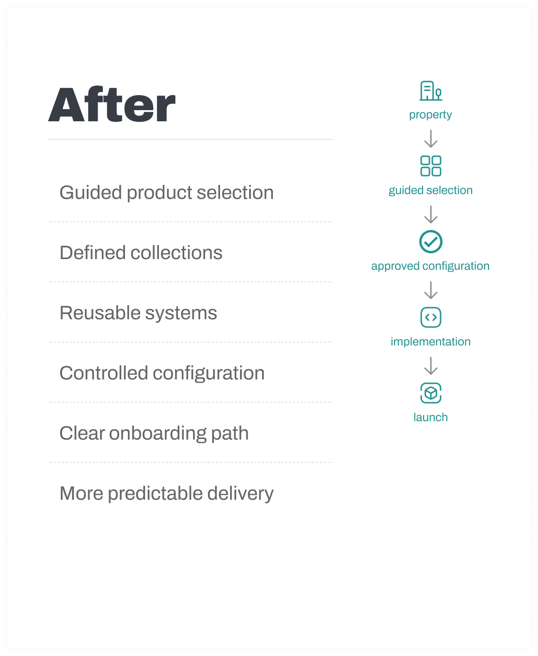
Predictable configuration
Easier expansion across multiple properties

foundation
The product direction began with the first premium template
As Art Director, I created the first premium collection template—defining its structure, visual direction, content hierarchy, voice, guided narrative, and quality standard. I also proposed a more personalized property-tour concept to make the experience feel guided rather than fragmented.
The template was approved and developed. While the personalized tour functionality was deferred, its structure and design direction became the foundation for a larger product opportunity: high-end template collections designed around different property audiences and markets.
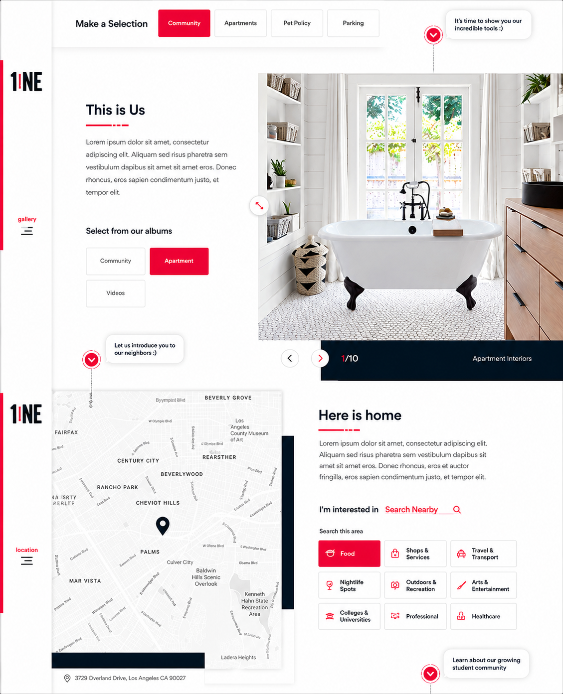
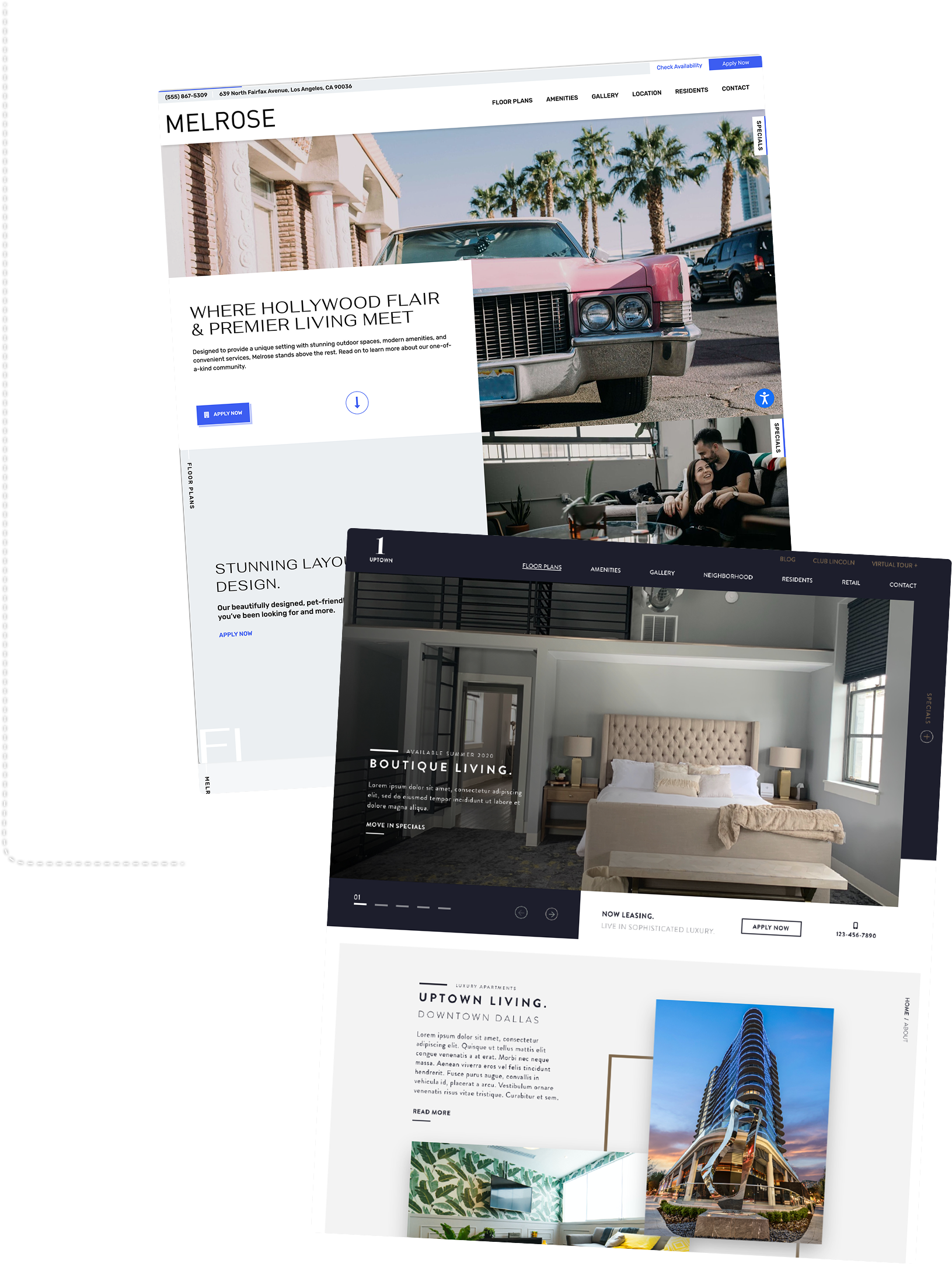
What began as a premium template became evidence for a larger product opportunity. As the initiative expanded, my role expanded with it—from art direction into collection strategy, product discovery, design systems, and selector definition.
Collaborated with:
Premium template direction
Collection art direction
Persona-based collection framework
Product brief + design-system direction
Cross-functional discovery with UX
Selector workflow + wireframe collaboration
Ongoing Product alignment
Product
UX
Customer Success
Implementation
Design
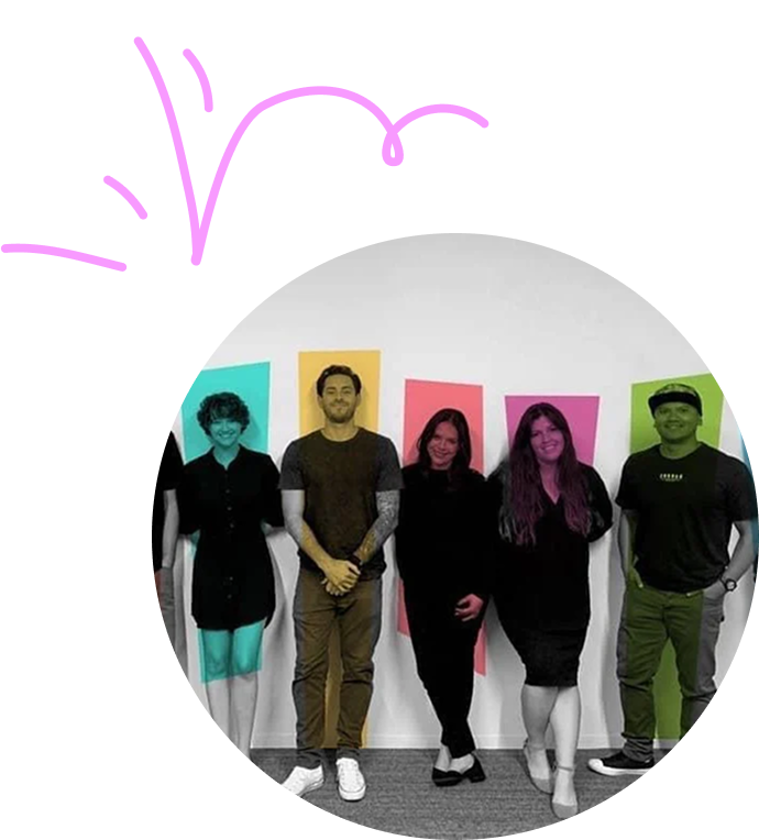
Worked closely with
Engineering
Sales
QA
discovery
We looked beyond the interface
Product provided the initial requirements for the Theme Selector. Before moving into interface design, the UX Lead and I worked across Sales, Product, Design, Engineering, QA, Customer Success, and Implementation to understand how selection affected the complete customer and delivery journey.
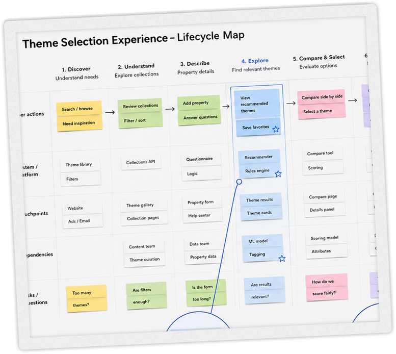
The key realization was that the selector could not be designed as an isolated tool. It was one decision point inside a much larger product system.

┄
design
┄
configuration
┄
qa
┄
launch
┄
sales
┄
product selection
┄ design ┄ configuration ┄ qa ┄ launch ┄ sales ┄ product selection
Fragmented knowledge
Each team understood a different part of the lifecycle.
Choice didn’t equal confidence
Customers needed help imagining the finished product, not more options to browse.
Selection continued downstream
Decisions reopened during onboarding when the experience didn't prepare customers for implementation.
Flexibility had a lifecycle cost
Configuration choices multiplied complexity across CMS, QA, Engineering, and delivery.
The problem changed from designing a selector to defining the product model the selector needed to represent.
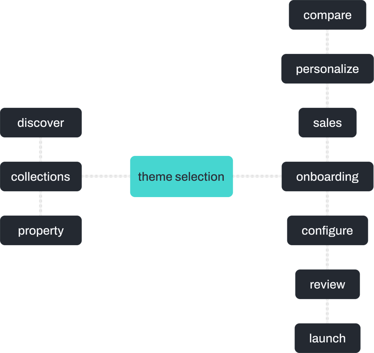
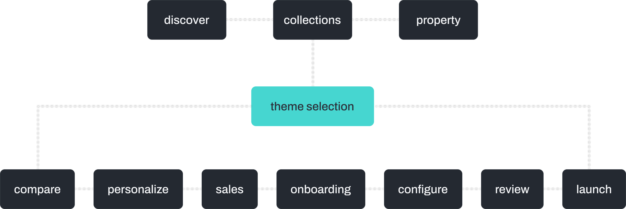
journey
Theme selection was only one moment in a larger journey
Discovery showed us that choosing a theme wasn’t an isolated decision. It connected what customers understood about the product with what Sales, onboarding, and Implementation needed to deliver it successfully.
The selector had to support the decision in front of the customer—and the work that followed it.


system
Designing the collections and the selector as one system
The Theme Selector needed a coherent product model to recommend. At the same time, the collections needed shared principles before customers could meaningfully compare them.
While I worked with the UX Lead on the selector workflow, I directed the design team in defining the collection systems—translating Product and Engineering requirements into a framework that could work consistently across themes.
The work came down to three strategic decisions.
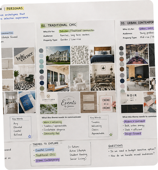
Audience, not trends
LeaseLabs served properties with very different audiences, markets, and business needs. I introduced persona-based thinking to define what each collection needed to support—from content and functionality to voice, visual expectations, and level of configuration.
The personas were product-planning tools, not decorative profiles.
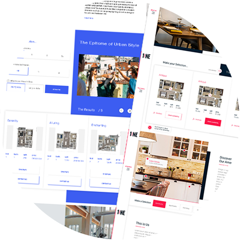
Standardize foundations, not identity
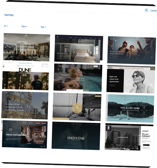
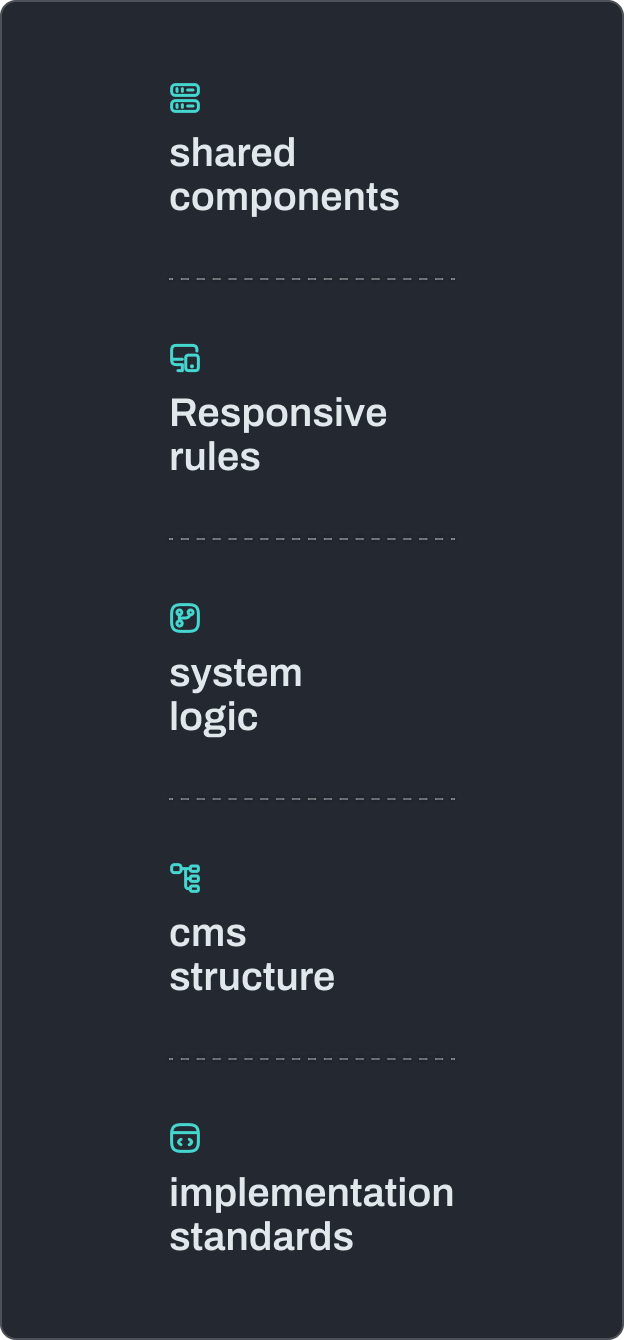
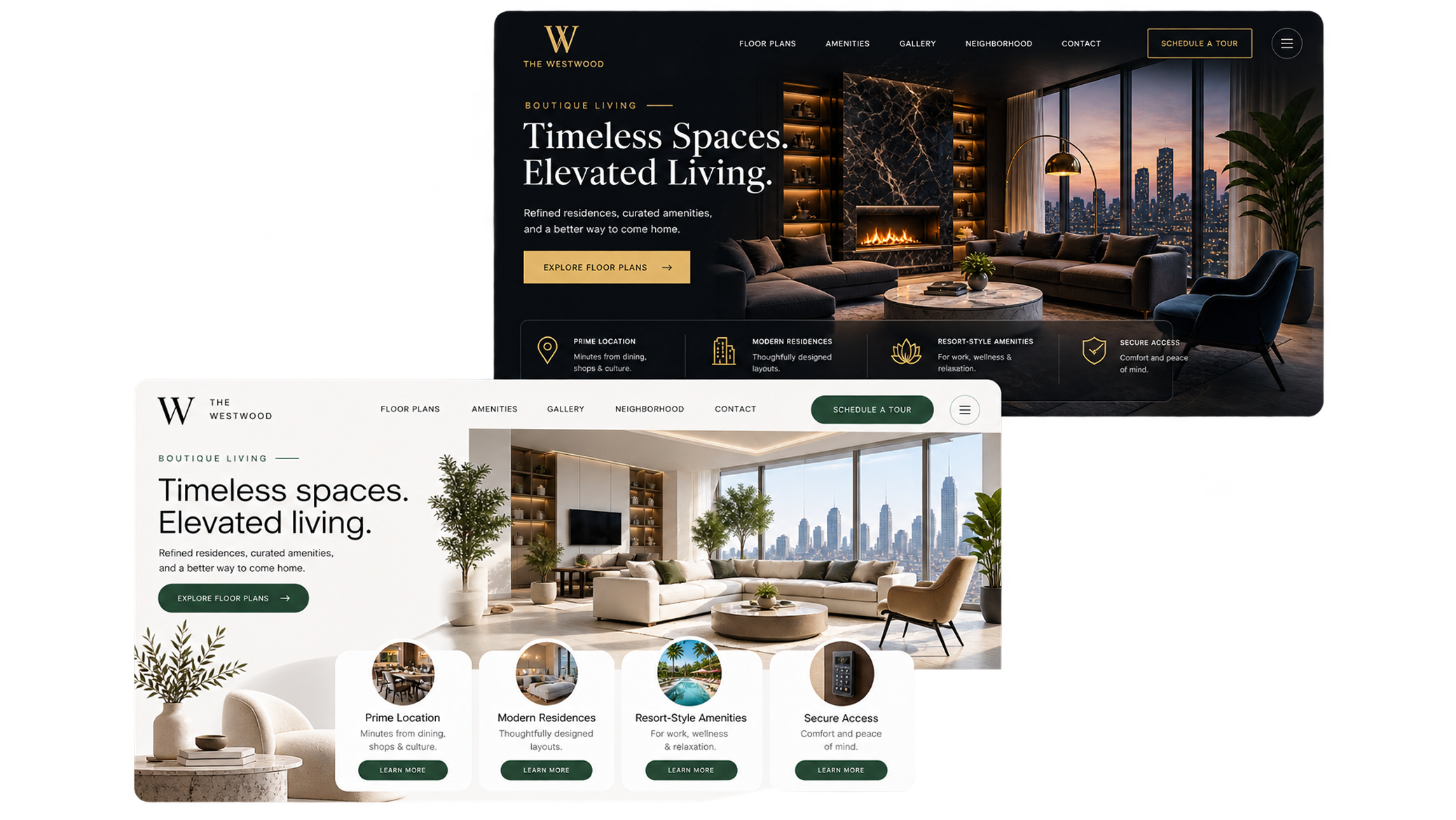
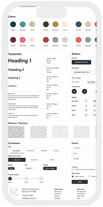
Themes shared structural foundations—component behavior, responsive rules, and implementation standards—while typography, color, imagery, composition, and voice gave each collection its own identity.
Consistency belonged in the system. Differentiation belonged in the experience.
Build in parallel
We didn't finish the collections and then design a selector around them. The selector helped define what customers needed to understand and compare, while the collection systems determined what the product could meaningfully organize, recommend, and configure.
customer journey
the shared product foundation
delivery system
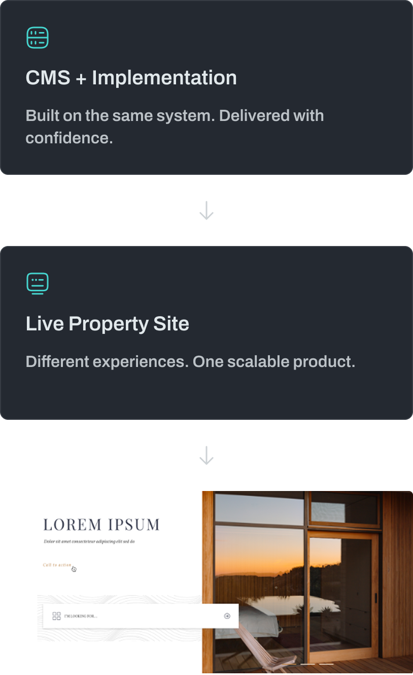
different experiences. one scalable product.


Boundaries
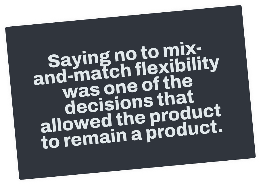
More flexibility would have made the product less scalable
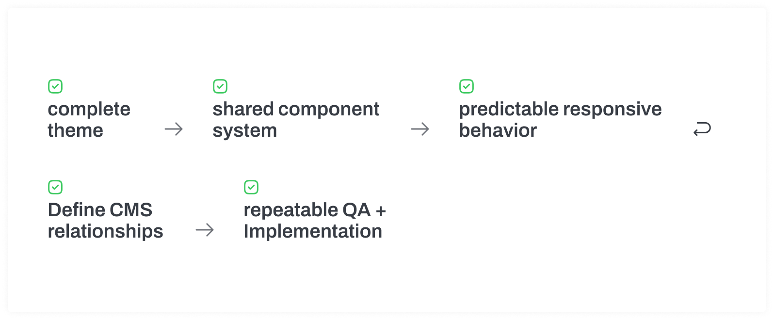
As we defined the Theme Selector, one idea seemed especially attractive: let customers mix and match components across themes.
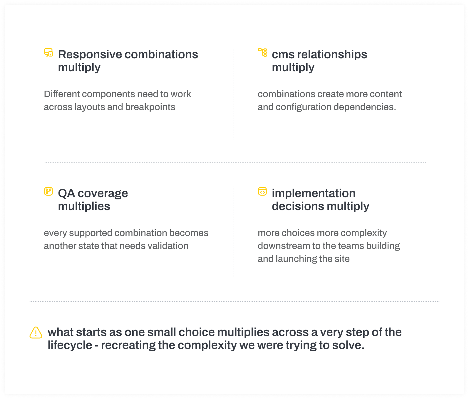
From a customer perspective, it sounded like more freedom. But when we evaluated the idea across Engineering, QA, CMS, Implementation, and Product, the trade-off became clear.
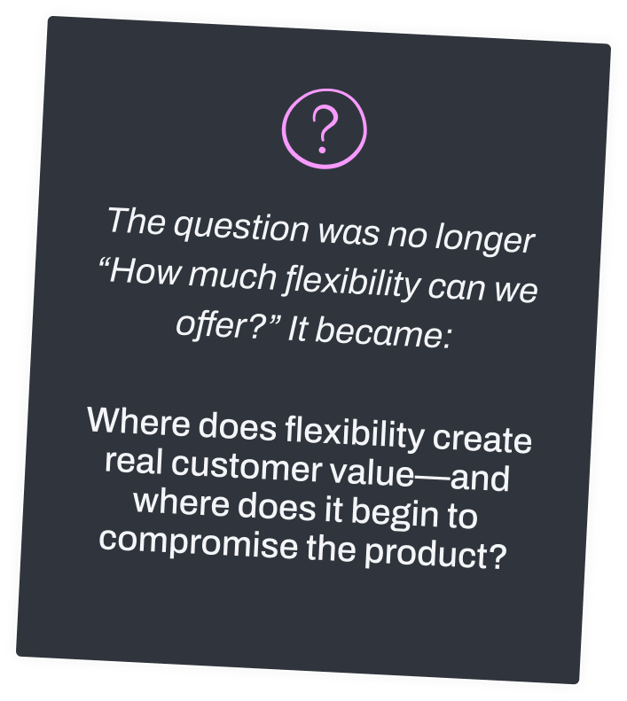
Every additional combination created complexity that had to be designed, built, tested, supported, and explained downstream.
What if customers could combine these?
one coherent theme
one component from another theme
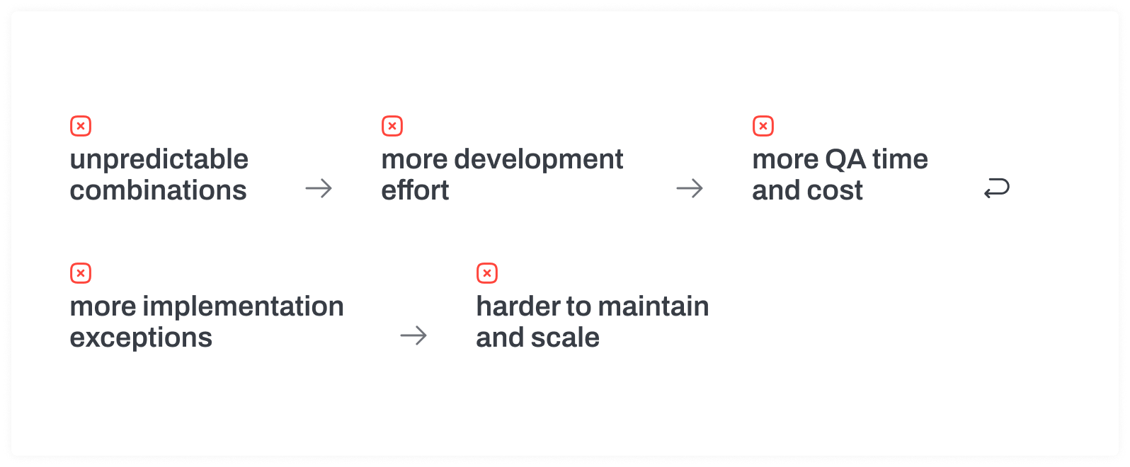
the system starts becoming custom again
the boundary
Personalize the experience. Protect the system.
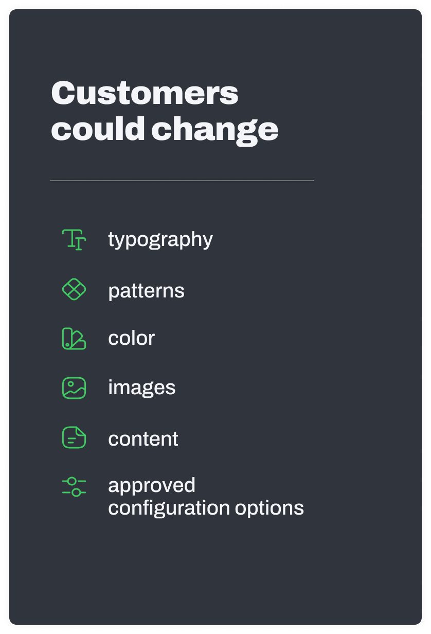
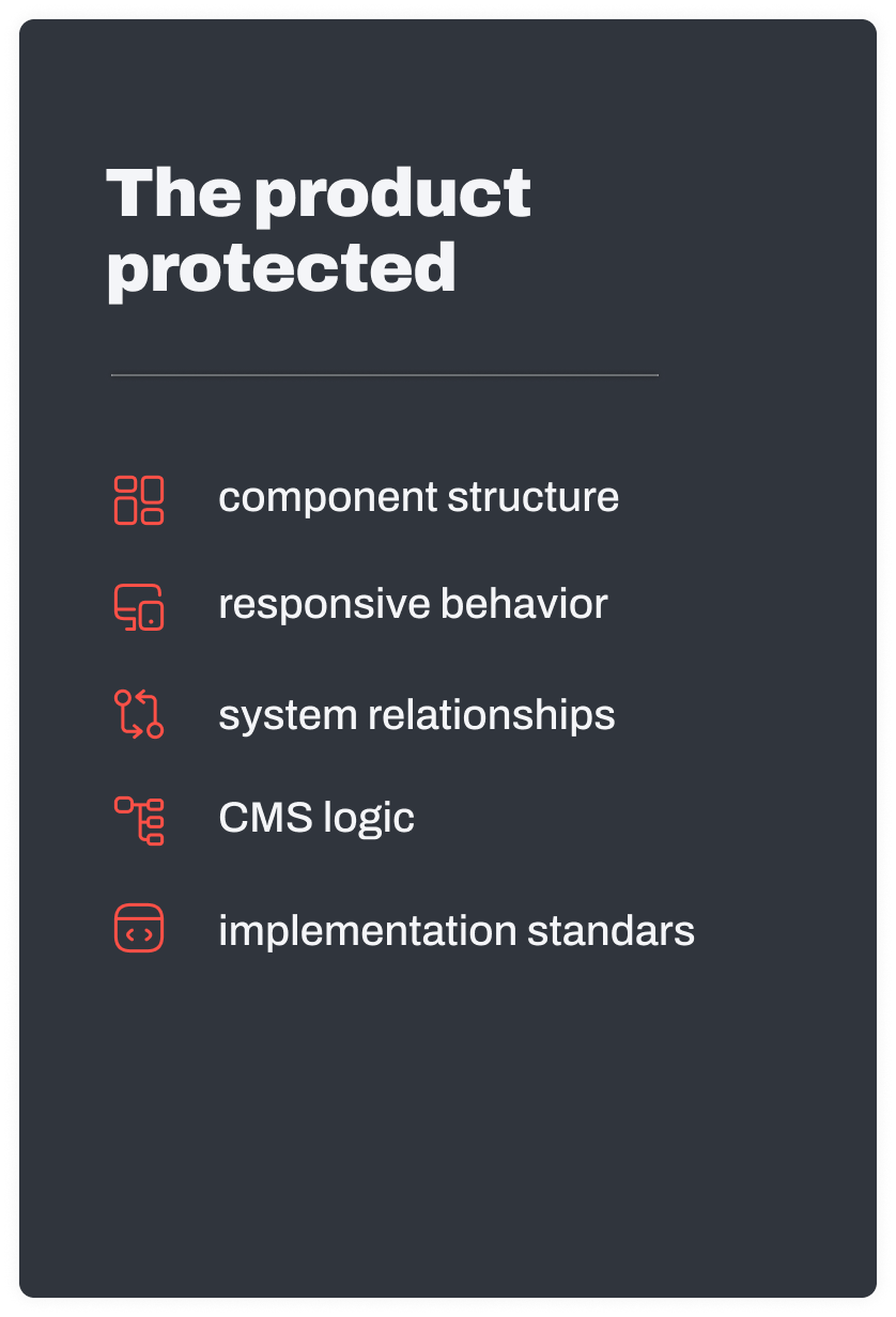
I recommended that customers personalize within a selected theme rather than mix components across themes. This gave them meaningful control over the parts of the experience that expressed their property and brand, while protecting the shared foundations that made the product reliable and scalable.
This wasn't about limiting choice for the sake of simplicity. It was about putting flexibility where it created value without transferring unnecessary complexity into Engineering, QA, CMS, and Implementation.

experience
Making a complex website product easier to choose
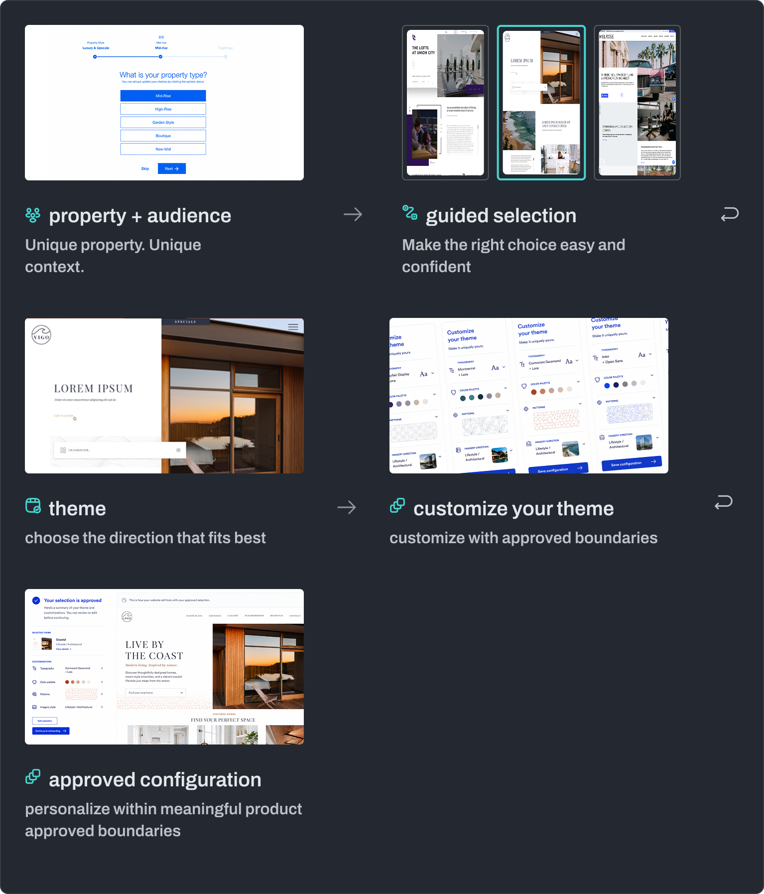
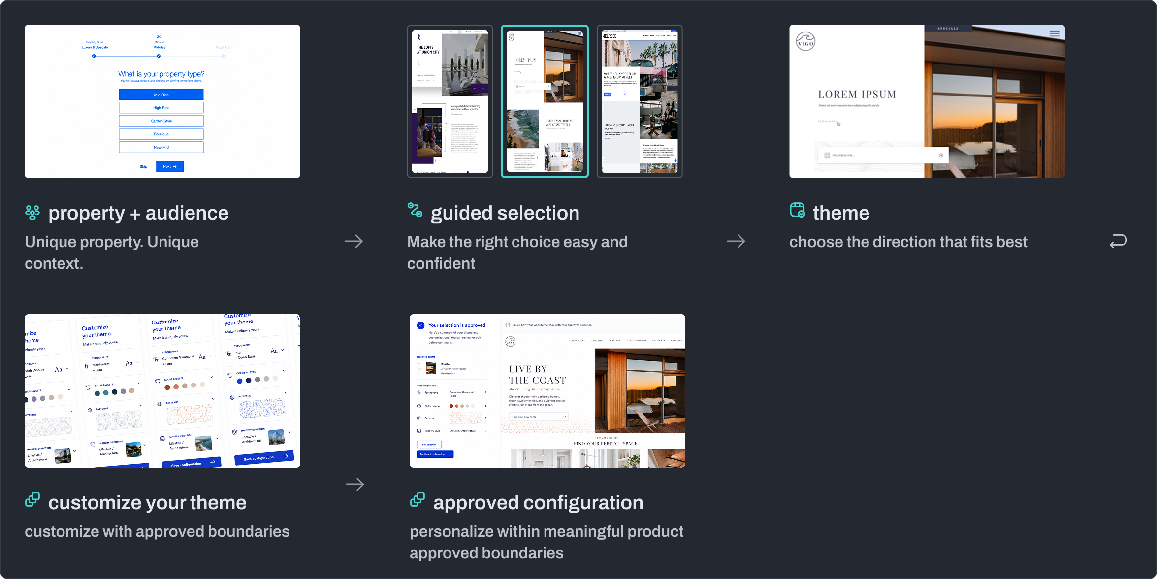
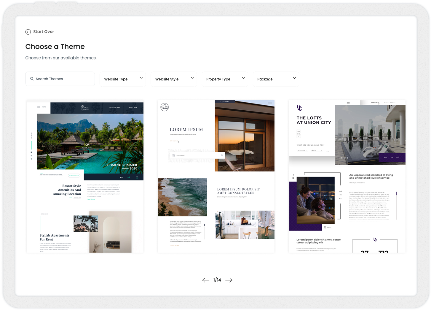
The Theme Selector helps customers move from uncertainty to confidence by guiding them through a clear, relevant set of choices.
It brings the collections, themes, and configuration together in a workflow that feels guided—not overwhelming.
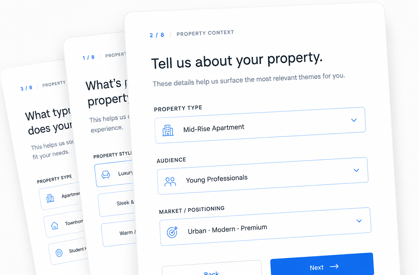
Understand the property
01
We start with a few key details about the property to understand audience, market, and goals.

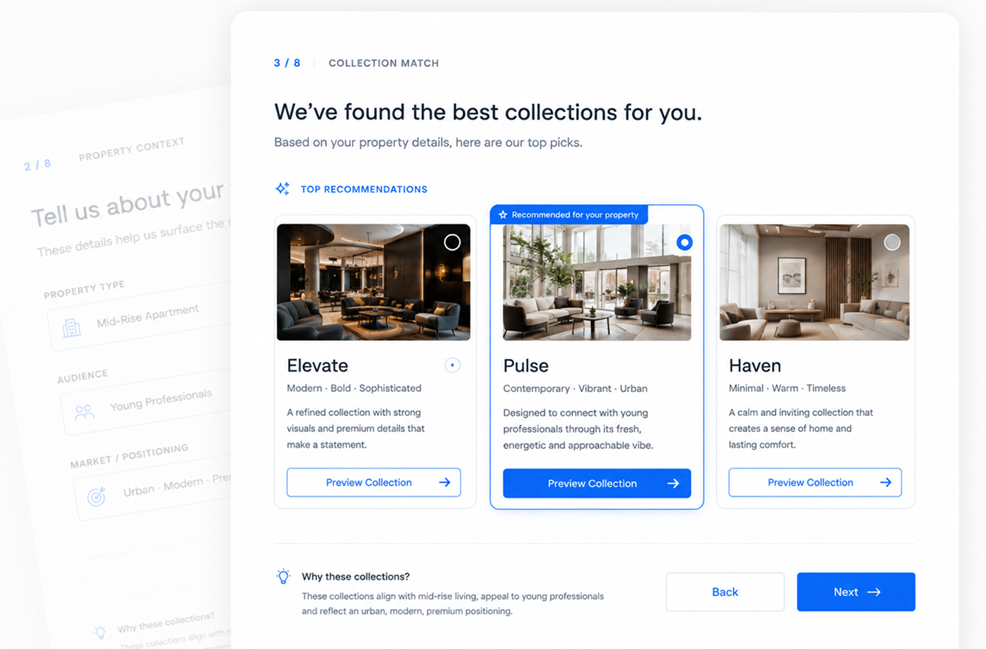
Narrow the collection
02
We recommend the collections that best match the property’s audience and goals.
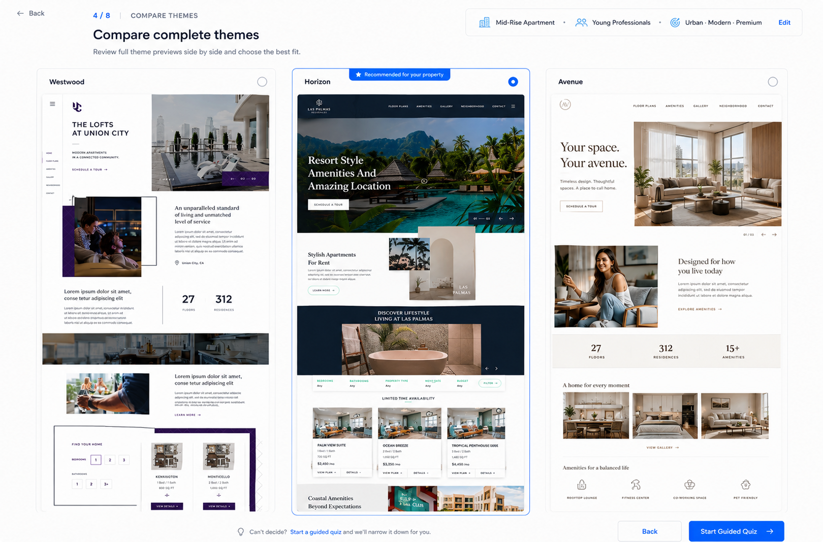
Compare complete themes
03
Customers compare full themes side by side—structure, content, and visual direction—at a glance.
04
After selecting a theme, customers personalize key elements and move seamlessly into onboarding.
Personalize and begin onboarding


approved configuration
share preview
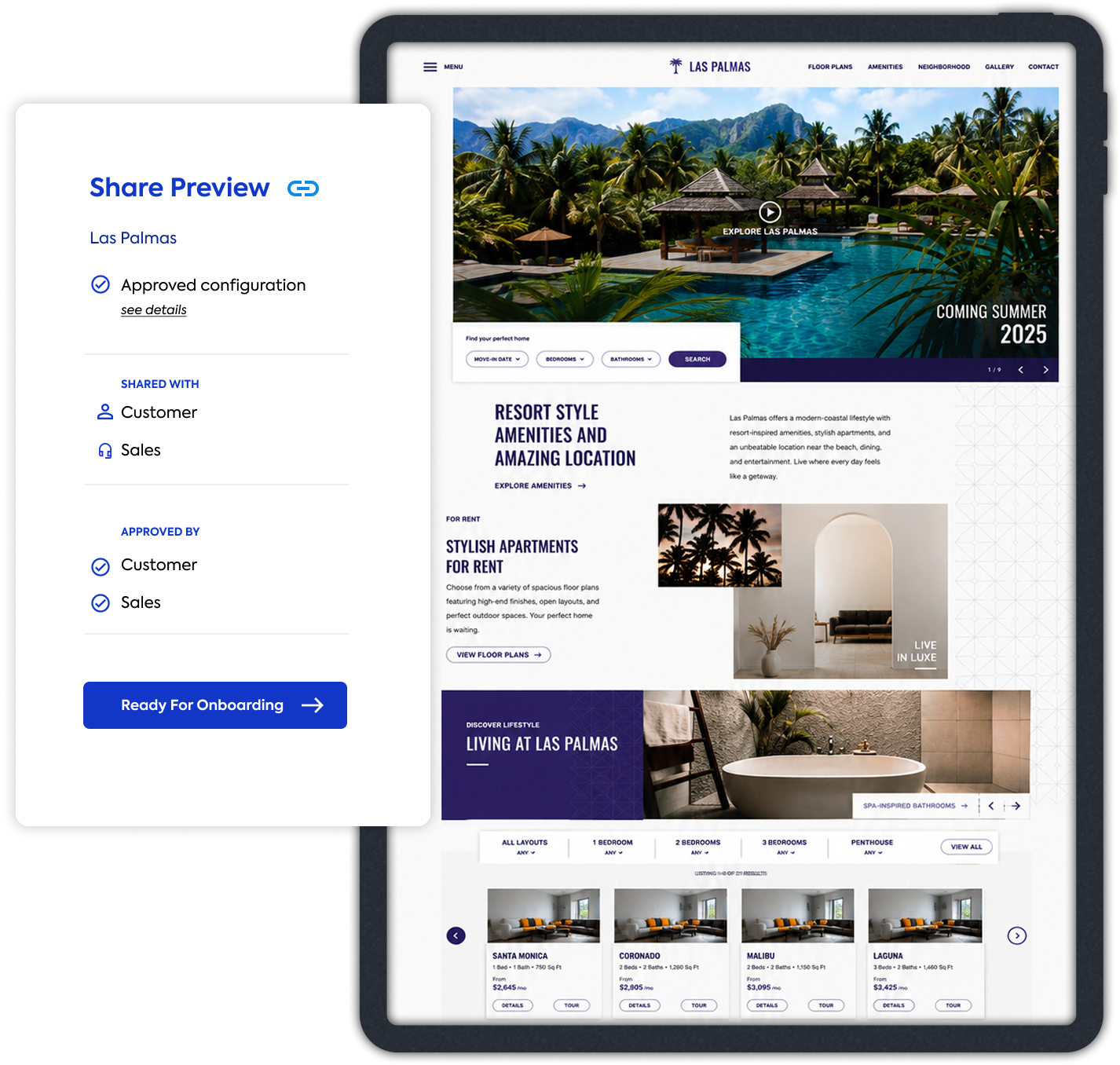
ready for onboarding

Build with sales in mind
Sales can share accurate previews, walk customers through the decision with confidence, and set the right expectations early in the process.
Design for what comes next
The selector hands off a clean, approved configuration to Implementation—reducing back-and-forth and keeping momentum through launch.
The selector is the bridge between customer confidence and operational clarity.
impact
The product model turned repeated custom decisions into a reusable system—giving customers a clearer path to the right website while making delivery more predictable for the teams behind it.
What changed

Scale +
adoption
The platform grew to 42 property sites as additional themes were built on the shared foundation.
of new clients chose the premium Theme option over a fully custom build.
PRODUCT FOUNDATION
8 core themes · 11 flexible containers · 20 shared design tokens
A reusable foundation across color, typography, patterns, components, and responsive behavior.
10 premium Plus Layout templates personally designed and delivered
Speed + delivery
Average delivery time for theme-based sites




Theme-based sites reduced the path from initial Sales contact to delivery from roughly eight weeks to five.
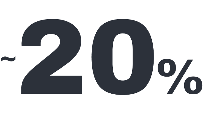

Component reuse reduced UI issues found during QA by an estimated 20%.
Business+ operations

Shared components and systems reduced repetitive Design and Engineering work.

Reusable foundations helped support more properties and larger portfolios without proportionally increasing Design and Implementation effort.
The framework supported premium themes that later became part of the RealPage platform.
The result wasn't simply a faster way to build websites. It was a more repeatable way to turn LeaseLabs' expertise into a product.
leadership
What I led
As the initiative expanded, my role grew from defining the original premium direction into product strategy, design systems, cross-functional discovery, and team leadership.
My focus shifted from designing every answer to creating the direction and shared foundations that helped the team make stronger decisions together.
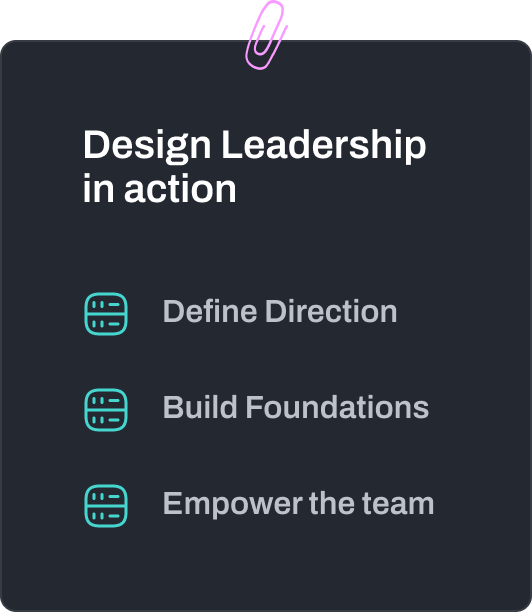
Connecting strategy, systems, and people to build a product customers can trust.
shared product direction
Connected the collection strategy to the broader product ecosystem.
I helped shape how collections, the Theme Selector, customer journey, and implementation model worked as parts of one product rather than separate initiatives.
Directed the shared foundations across collections
I translated Product and Engineering requirements into reusable structures and standards while preserving the distinct identity of each collection.
DESIGN SYSTEMS
Helped teams see the complete lifecycle
Working with the UX Lead, I brought together perspectives from Product, Sales, Engineering, QA, Customer Success, Implementation, and Design to uncover dependencies and trade-offs across the experience.



PRODUCT DIRECTION
CROSS-FUNCTIONAL DISCOVERY
TEAM ALIGNMENT

Created a framework designers could make decisions within
I translated product constraints and strategic principles into briefs, system guidance, design reviews, and shared standards—giving the team room to explore while keeping the product coherent.
PRODUCT BOUNDARIES

Protected the parts of the system that needed to remain stable
I recommended configuration boundaries that preserved meaningful customer choice while protecting component relationships, product quality, and operational scalability.
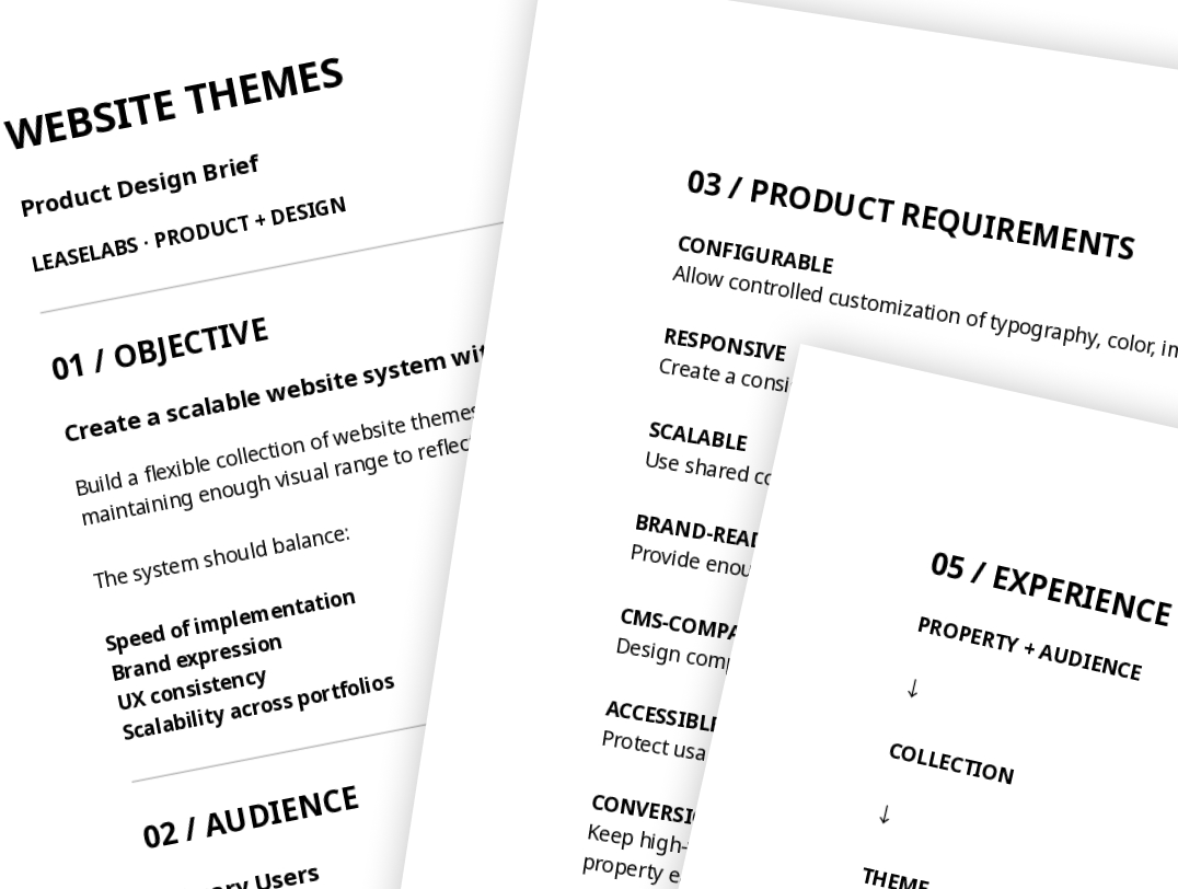
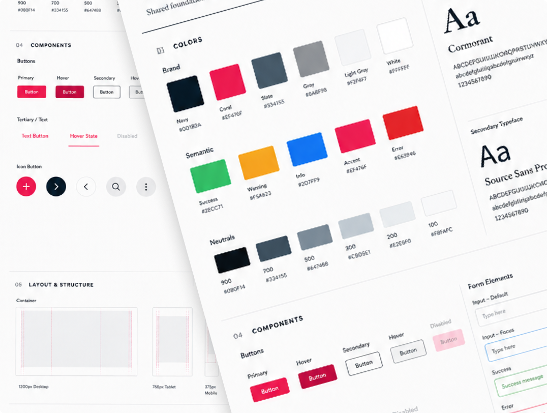
The goal wasn't to make every decision myself. It was to create enough clarity for the team to make strong decisions—and enough structure for the product to scale.
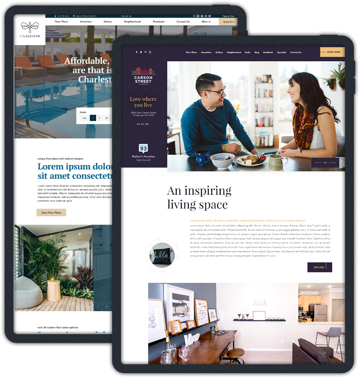
still hands-on
Alongside product strategy and team leadership, I stayed close to the craft—designing production-ready templates while helping establish the systems they shared.
For the supporting system callout:
8 core themes · 11 flexible containers · 20 shared design tokens
reflection
What this project reinforced
I started by designing one premium website template. As the work expanded, so did the problem—from a single experience into a system connecting collections, customer choice, reusable components, Sales, onboarding, and implementation.
The most important decision wasn't how an individual theme looked. It was understanding where the product should remain flexible—and where constraints created greater value.
The experience reinforced something I still bring to product work today: the interface is only one part of the problem. Stronger decisions come from understanding the system around it—the people, dependencies, and trade-offs that determine whether an experience can work at scale.


the beginning
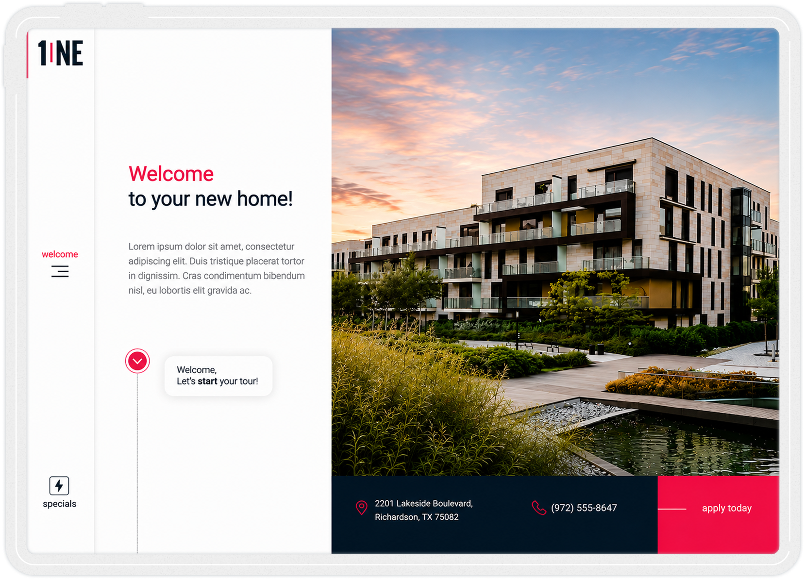
a premium template
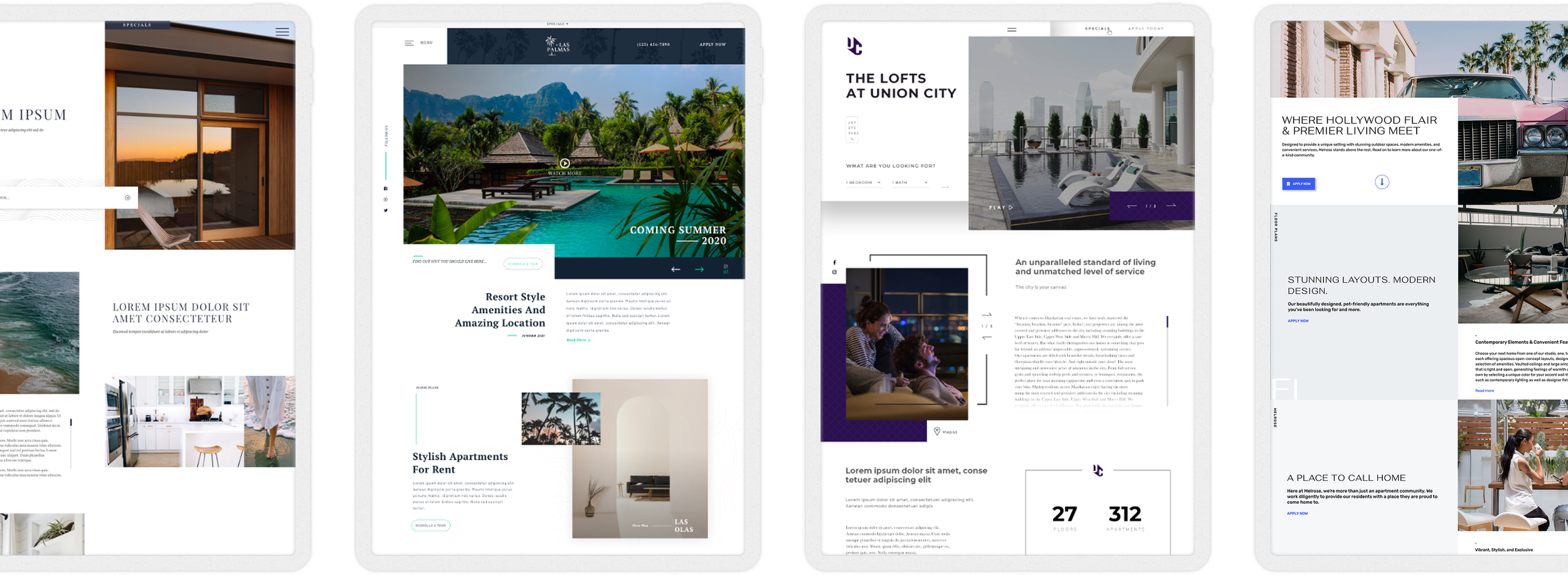
collections
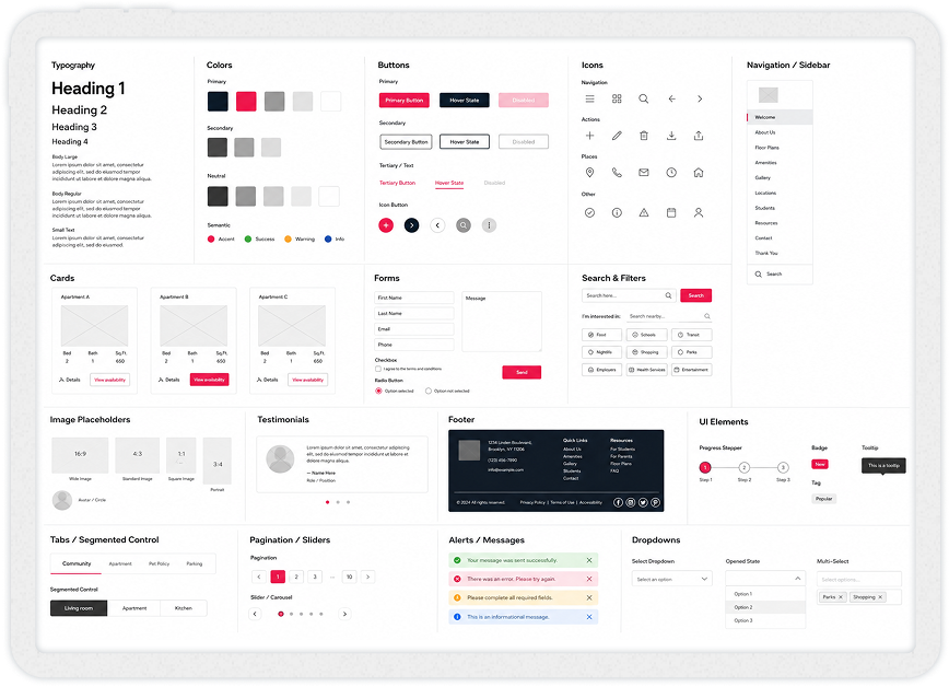
system
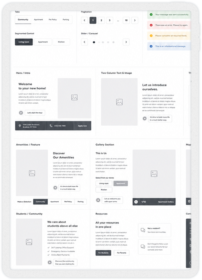
selector
what it became
a reusable product foundation
Understand the complete system.
Make the trade-offs visible.
Give teams enough clarity to build the right thing together.
NEXT
CHAPTER

Designing premium digital experiences inside the Genesis ecosystem
Enterprise standards, complex delivery requirements, and premium customer journeys across automotive products.
